Hodges' Model: Welcome to the QUAD: infographic

Hodges' model is a conceptual framework to support reflection and critical thinking. Situated, the model can help integrate all disciplines (academic and professional). Amid news items, are posts that illustrate the scope and application of the model. A bibliography and A4 template are provided in the sidebar. Welcome to the QUAD ...

Showing posts with label infographic. Show all posts

Sunday, April 14, 2019

Infographic: What does the UK spend on health and social care?

c/o John Appleby and BMJ


The political impact of this spending have huge ramifications for many individuals 
in terms of efficiency, effectiveness, equity and equality.

individual
|
INTERPERSONAL : SCIENCES
humanistic ----------------------------------------------- mechanistic
SOCIOLOGY : POLITICAL
|
group - population

Source:


Sunday, December 02, 2012

FatFonts - fonts with real weight: Giving space and data form

Links now appear broken ...

How it works (from fatfonts.org):

Fatfonts are designed so that the amount of dark pixels in a numeral character is proportional to the number it represents. For example, “2″ has twice the ink than “1″, “8″ has two times the amount of dark ink than “4″ etc. You can see this easily in the set of characters below:


Source for the above and animated: http://visual.ly/fatfonts-player?view=true

My source: Jacob Aron, Making numbers punch their weight, New Scientist, 5 May 2012, 214, 2863, p.12.

Wednesday, November 28, 2012

RFID Tags Track Possible Outbreak Pathways in the Hospital

There is no substitute for providing evidence that confirms many common-sense assumptions about what happens in the clinical environment that is the ward - in this case paediatrics.

See the links below for details and explanation.


My source: John Matson. Graphic Science. Scientific American, November 2012, page 76.
See also the original PLoS ONE paper.

Saturday, August 04, 2012

IdN Extra 07: Infographics — Designing Data

Visiting Manchester twice this past fortnight I'd noticed this IdN special issue on infographics in the Cornerhouse shop. The shop's only small but there is lots to dive into - arts, media, design and philosophy.

When a database becomes a thing of beauty

Infographics or information graphics are visual representations of information, data or knowledge. They are often used when complex information needs to be presented as quickly and effectively as possible, such as signs and maps. Infographics can be as simple as a bar chart or a pie graph to represent percentages in business information; or as elaborative as some of the examples in this book to communicate stories in newspapers and magazine.

Infographics can be entertaining when the information they represent is of personal interest; but it is especially fun and challenging when the topic may be as dry as representing concepts in technical manuals or scientific statics.

 <->

I don't know if it's the reduced scale, or my right eye talking but some of the text descriptions are difficult to read. The graphics and ideas are stunning, both in themselves and the questions they provoke.

Monday, January 16, 2012

Social Media in Healthcare Infographic

Social Media in Healthcare

Via: PowerDMS

Although the emphasis of this graphic is USA centric there are many aspects that apply generally, especially social media policy. If anyone has health care infographics with a UK, EU, developing nations focus please get in touch.

Thanks to Ray Lau, Graphic Designer for approaching me regards this.

Tuesday, December 06, 2011

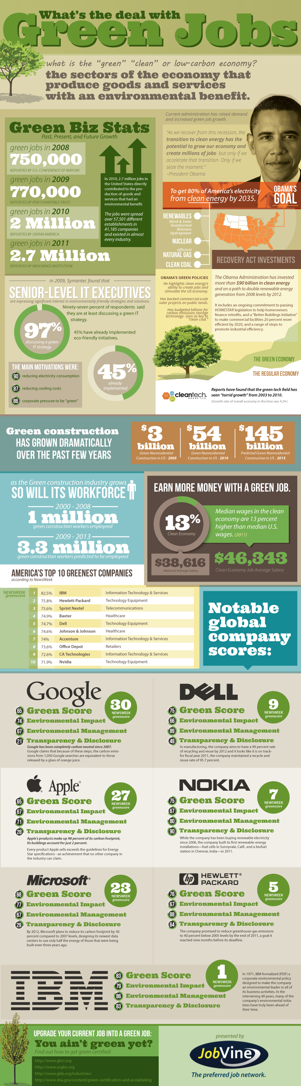
Green Collar Jobs: The Big Picture (Infographic)

I like big pictures :) especially those that point the way to a greener global future.

For text and my source please see:
...

Infographic by Jobvine Jobs

What is the deal with Green jobs

Tuesday, April 06, 2010

How can maps provide motivation?

"The class of maps that go beyond navigation to consolidate thought and convey a message belong to the broader class of infographics that aggregate words and numbers in a visual medium. While charts and graphs are often used to show progress to a goal, nothing personalizes the objective like measuring status, and revealing shortcomings, on a map."
-- Matt Ball, editor, the Americas / Asia Pacific


My source: V1 Newsletter Volume 4 / Issue 13/ March 30, 2010

http://twitter.com/spatialsustain

Sunday, April 27, 2008

Grammar in Visual Language

I've just watched a Vizthink podcast which I found on Neil Cohn's blog 'The Visual Linguist':

What qualifies as visual language anyway?

As usual - click when running - and the podcast will fill the screen. In addition to the discussion and slides there are many other sources to explore. A news map example had me thinking about Hodges' model and problems within the four care domains. If in addition to clinical staff, managers and policy makers really do want to see evidence of person-centred care and carer's views being taken into account; then how fine-grained should the care map be?

(Or is it just a tick in 'a' box?)

News is one thing, but is there an optimum level for care? Plus of course problems are not the only fruit - there are strengths too...